Events Design
Delivered end-to-end event branding solutions including stage design, collaterals, and experience-driven visuals for international events.
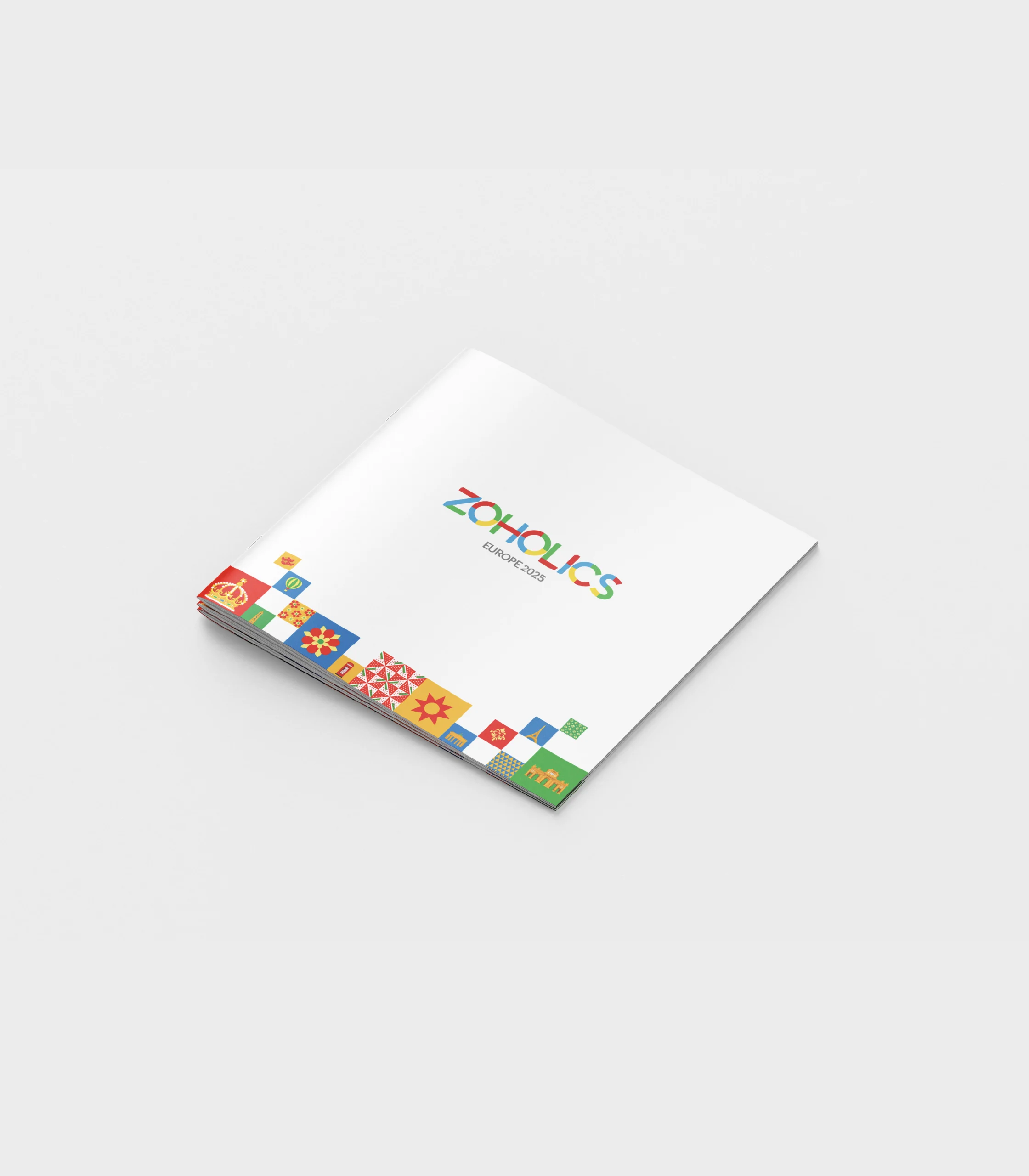
Zoholics Europe – Event Design Ecosystem
Project Overview
Design a comprehensive visual identity for Zoholics Europe, Zoho’s flagship European customer event where thousands of businesses gather to explore product innovations, discover new features, and build meaningful connections across borders.
The Challenges
Create a unified visual identity that celebrates European cultural diversity while maintaining Zoho’s global brand consistency
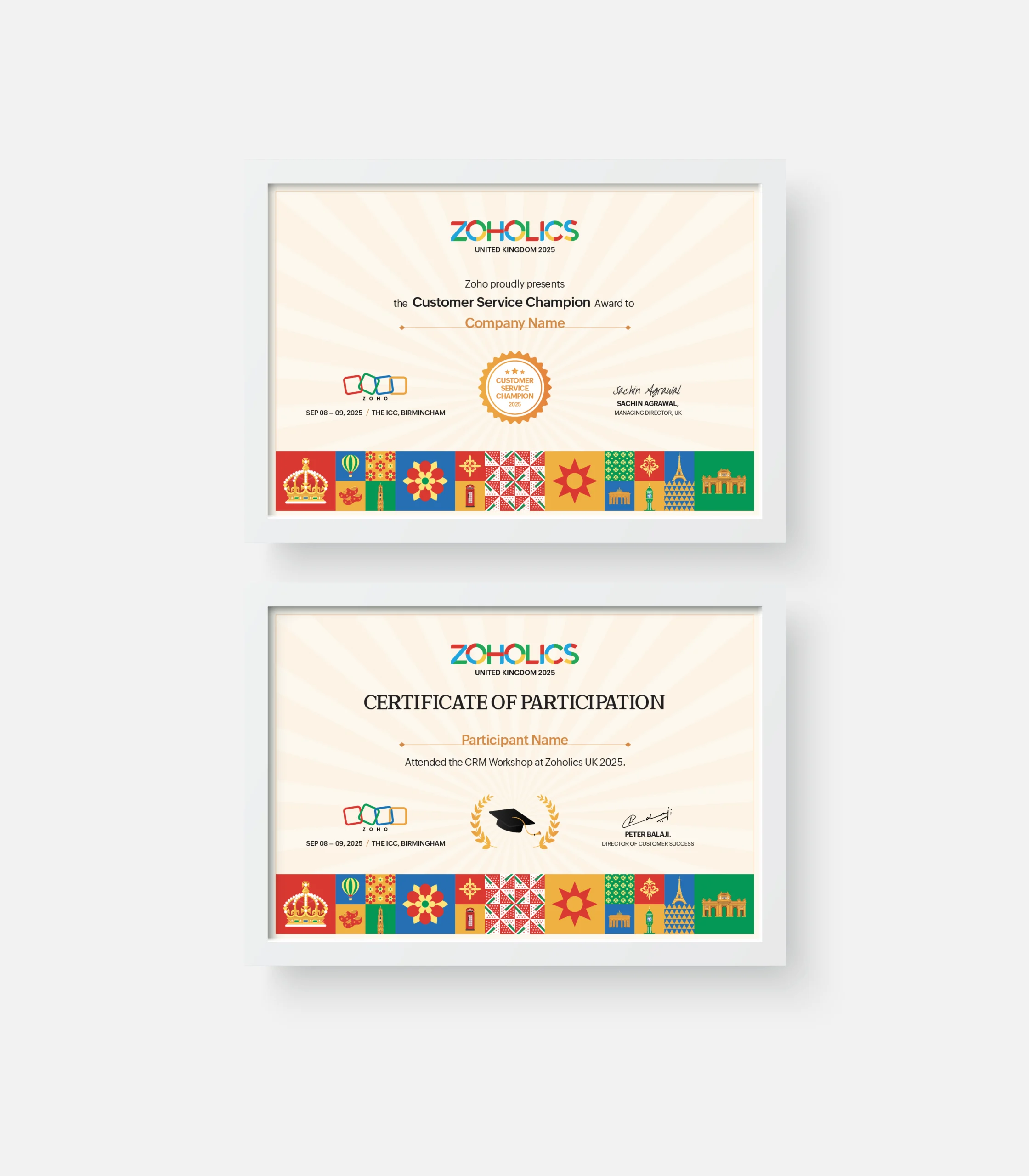
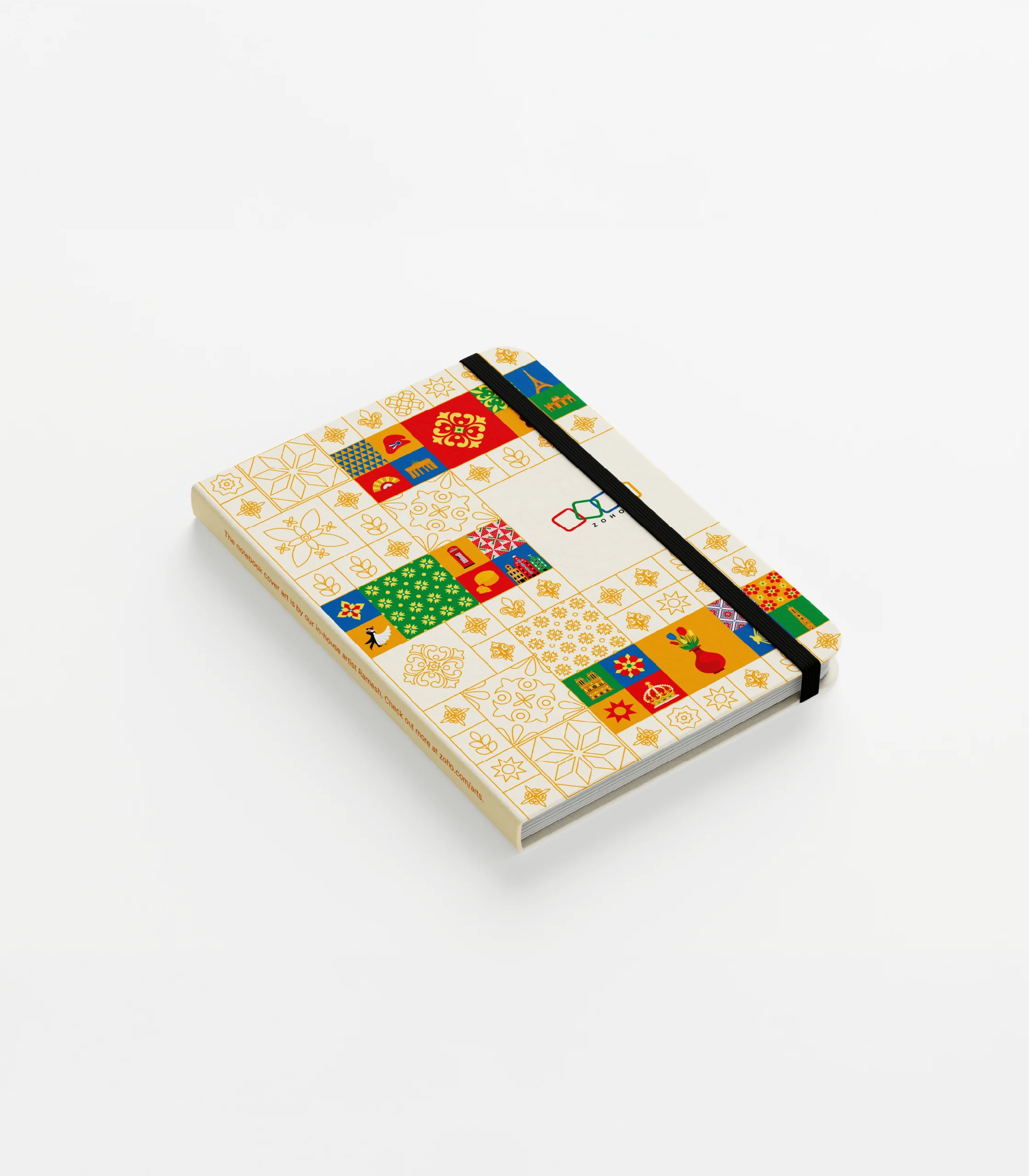
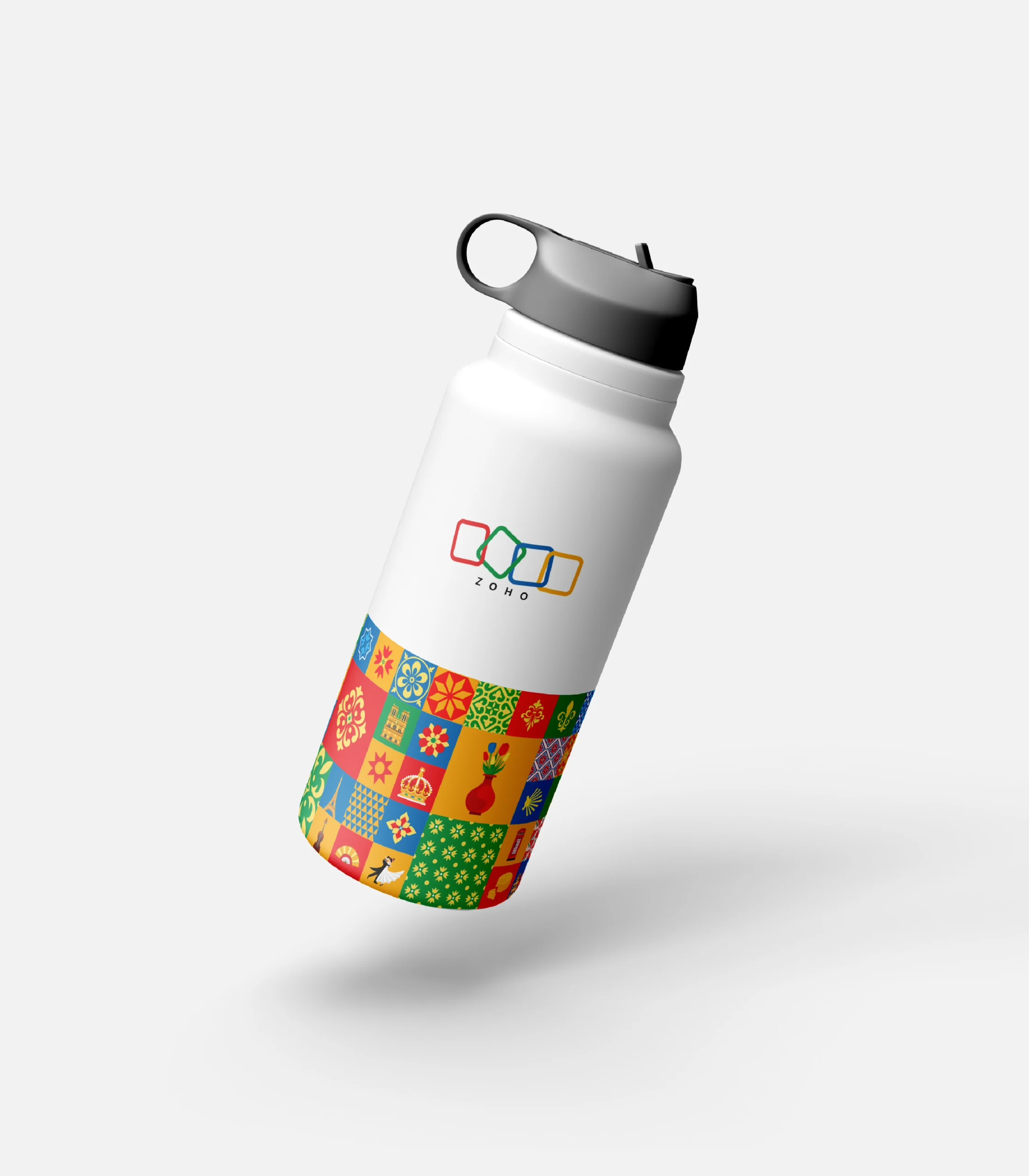
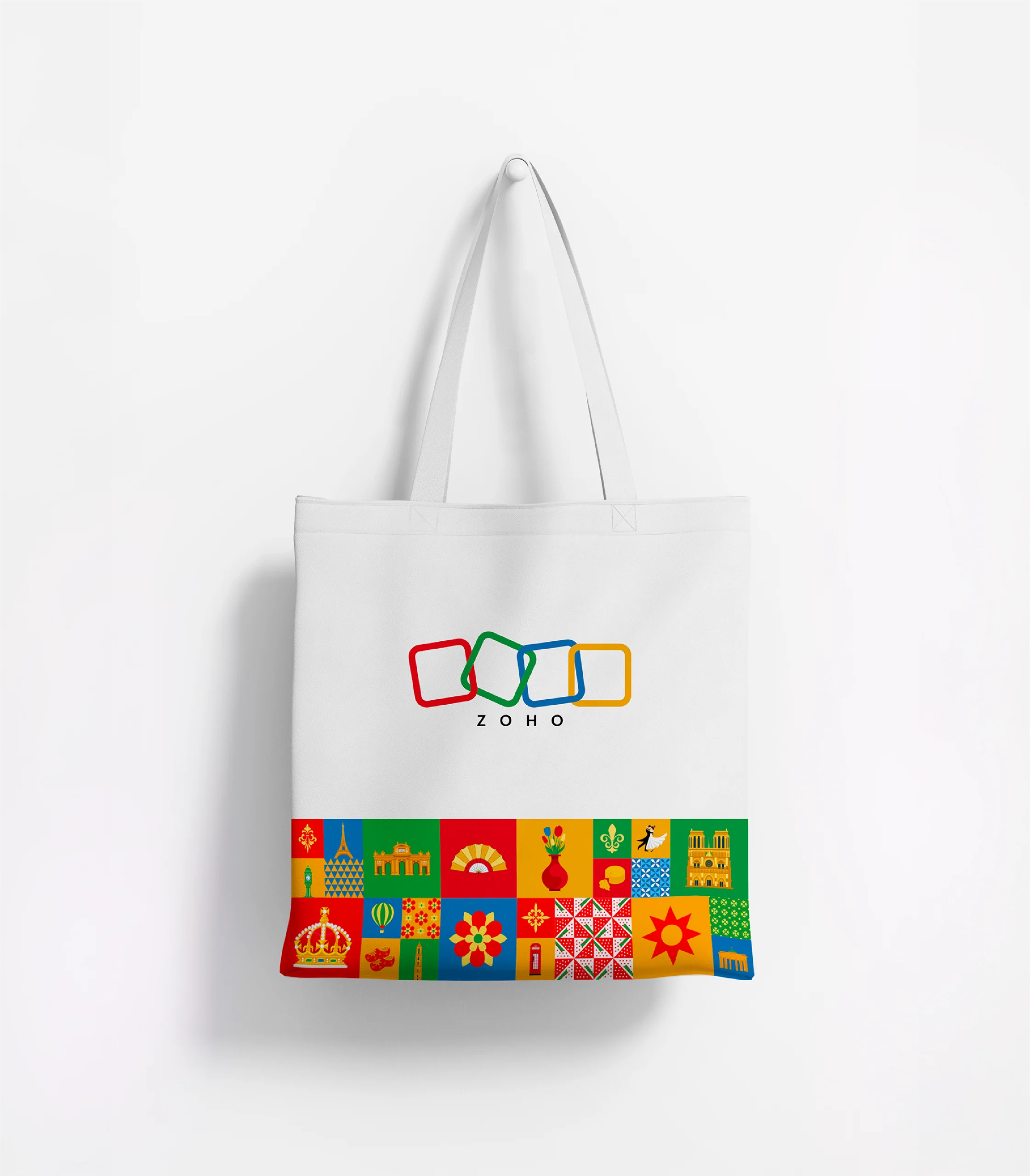
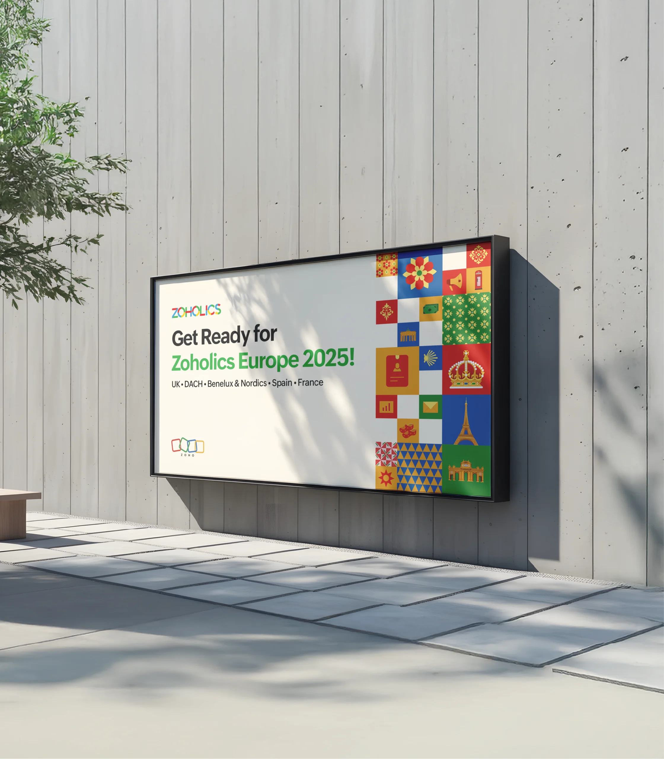
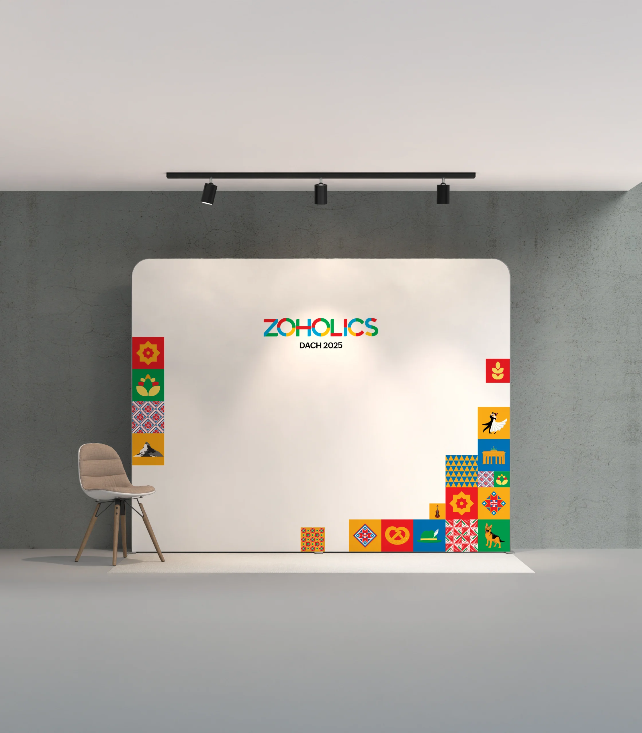
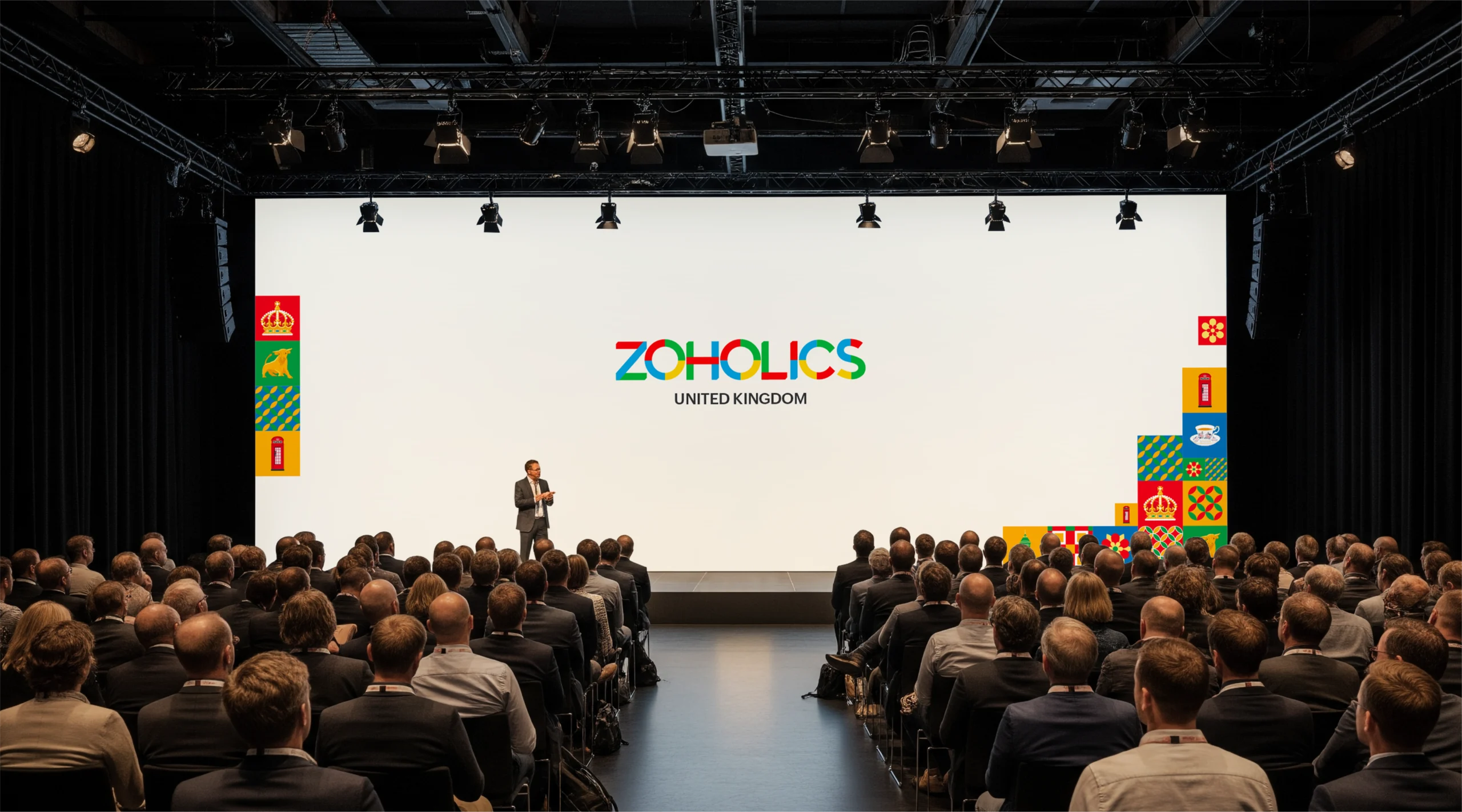
The Solution – Technology Meets Tradition
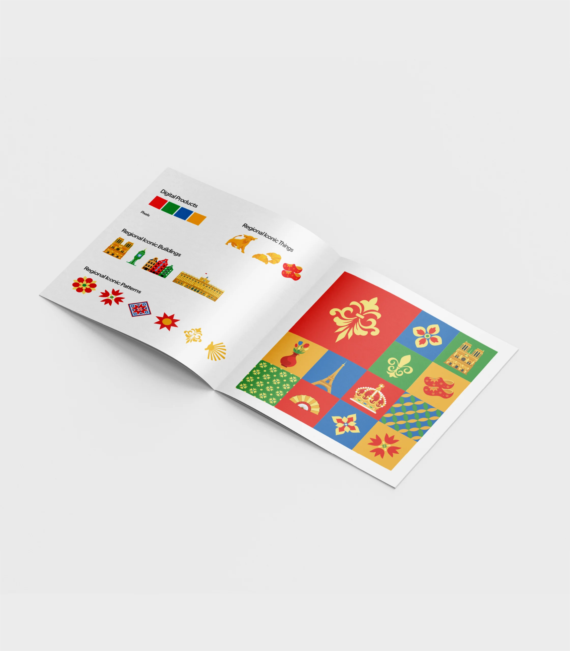
Event branding concept, I started with Zoho’s four signature colors Red, Green, Blue, and Yellow. These colors represent digital pixels, which perfectly align with Zoho’s identity as a SaaS-based technology company. Building on that foundation, I wanted to create a design that feels connected to the European audience. To achieve this, I integrated iconic European elements, buildings, and patterns into these pixels, capturing the essence of European culture. This combination blends technology with tradition, reflecting how Zoho stays deeply connected to local culture while maintaining its global digital presence.
Business Impact – Strategic Outcomes
Cultural Intelligence
Positions Zoho as a company that invests in understanding local markets, not just selling to them.
Memorable Experience
The culturally rich design creates Instagram-worthy moments that attendees naturally want to share, extending brand reach organically.
Competitive Differentiation
While competitors use generic event templates, Zoho demonstrates thoughtful localization, a proof point for their “global reach, local understanding” positioning.
Scalable Framework
The pixel system becomes a reusable library that grows with each European market Zoho enters.
My Design Process
1. Understanding the Foundation
Started with Zoho’s brand essence, what do the colors represent? How does their digital identity manifest visually? What makes Zoho distinctly Zoho?
2. Research & Cultural Authenticity
Studied European design history, architectural styles, traditional patterns, and regional symbols. Goal: Avoid tourist clichés and find elements with genuine cultural meaning.
3. Conceptual Integration
Developed the pixel metaphor as the bridge, digital enough for a tech brand, tangible enough to carry cultural patterns. The key was making technology and tradition feel naturally unified, not forced together.
4. System Development
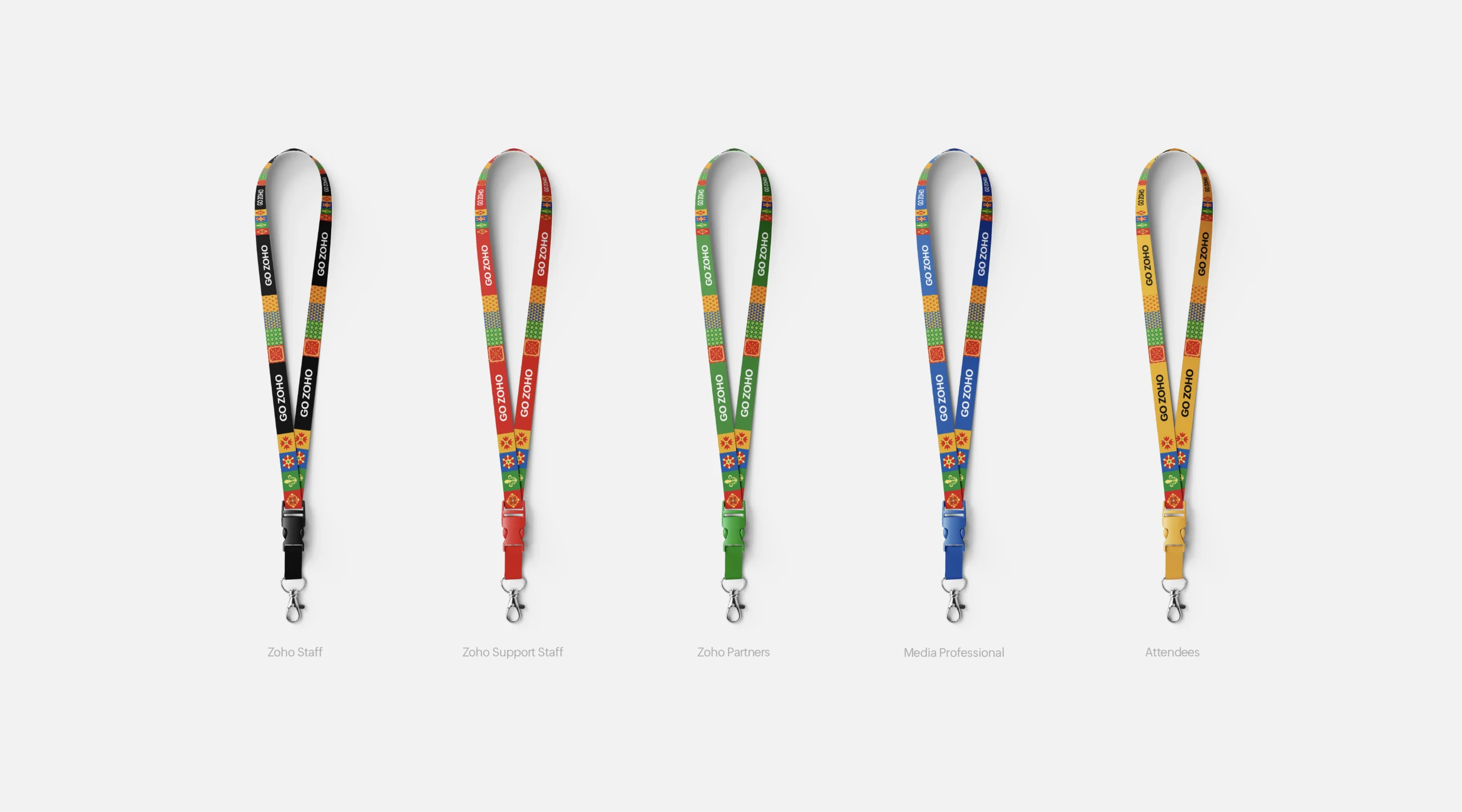
Created a modular framework where any combination of colored pixels can tell different cultural stories while maintaining brand coherence.
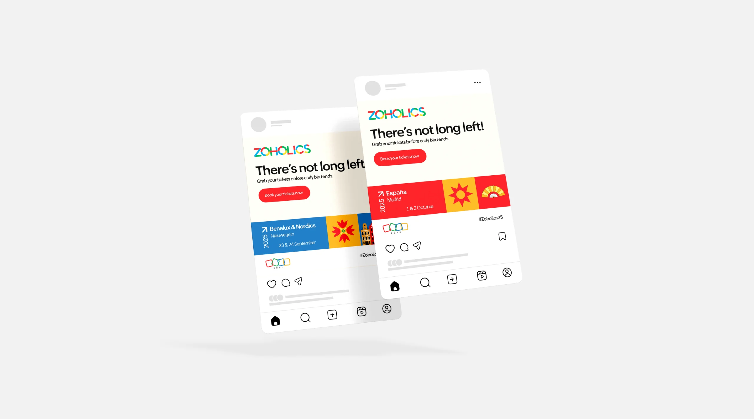
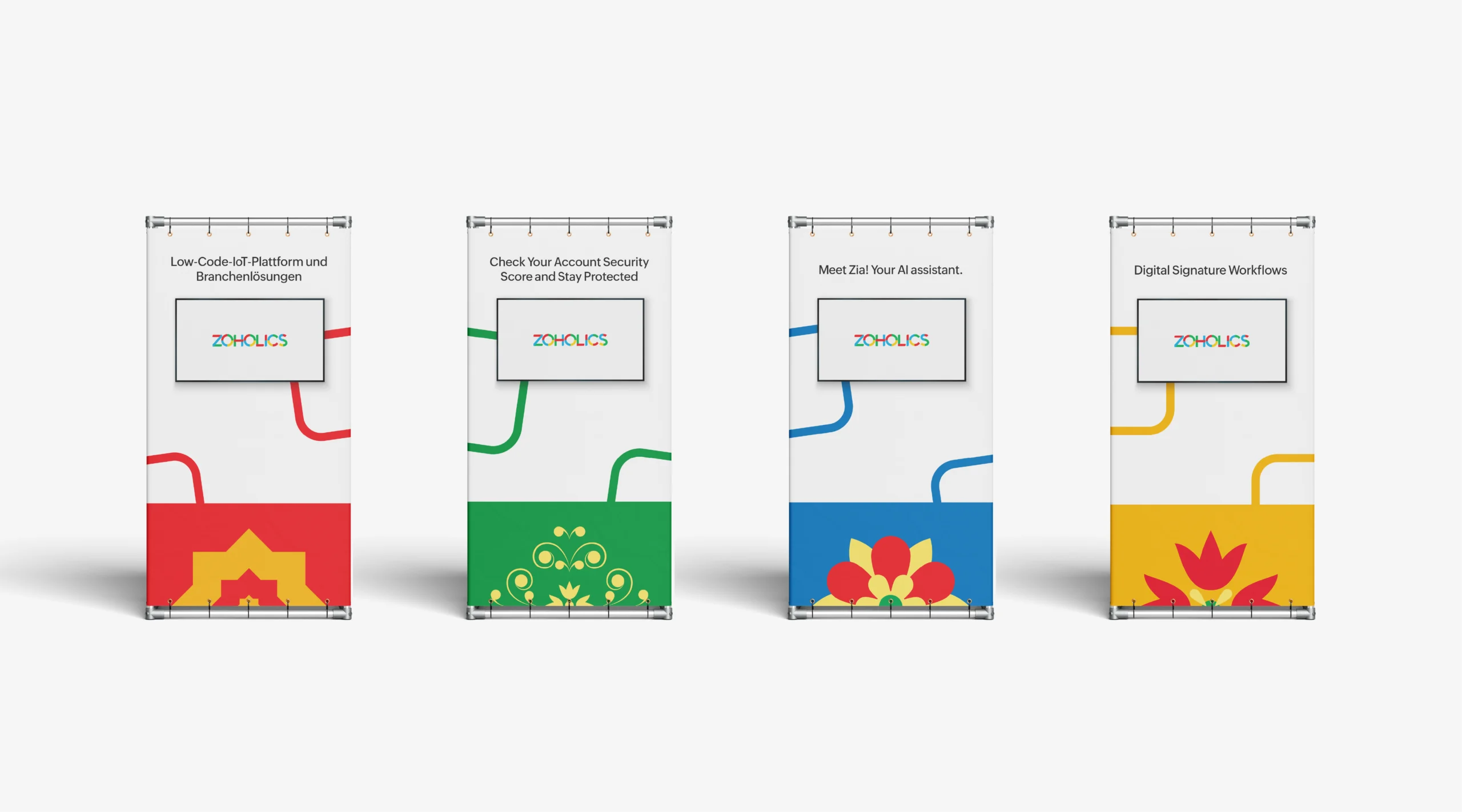
5. Multi-Touchpoint Application
Ensured the system works equally well on a mobile screen, printed badge, massive stage backdrop, or Instagram post.
Design Impact
The final branding system delivered a visually cohesive and culturally resonant identity for the event. By merging Zoho’s digital pixel language with meaningful European cultural elements, the design strengthened audience connection, increased brand recognition, and elevated the overall event experience. This fusion of technology and tradition not only reinforced Zoho’s global identity but also highlighted the company’s commitment to engaging authentically with regional audiences.